Simple changes for big impact: How to improve website accessibility
Introduction:
At Marvellous Humans, we believe that having an accessible website is a necessity. By making your website more accessible, you’re opening the doors to a wider audience and showing that you value inclusivity. In this post, we’ll explore some simple content and design changes that can help small business owners improve the accessibility of their websites. Let’s get started!
Structure your content correctly
Proper content structure is essential for people who use screen readers or have cognitive challenges or disabilities. Use headings to structure your content logically, following a clear hierarchy. Ensure that you don’t skip heading levels, as this can confuse people who rely on screen readers and impact the understanding of your content. Proper structure promotes better accessibility and usability for all.

Make your website easy to read
One of the fundamental aspects of website accessibility is ensuring that your content is easy to read. You can test the readability of your content by using tools like the Flesch-Kincaid Readability Test. We use a variety of tools to test and improve our content, but we love Hemingway editor (https://hemingwayapp.com)
Write your content in Plain English avoiding complex jargon or technical terms. Remember, your goal is to communicate with as many people as possible, so simplicity is key. Go to Plain English Campaign for more information.
Write clear and descriptive link copy
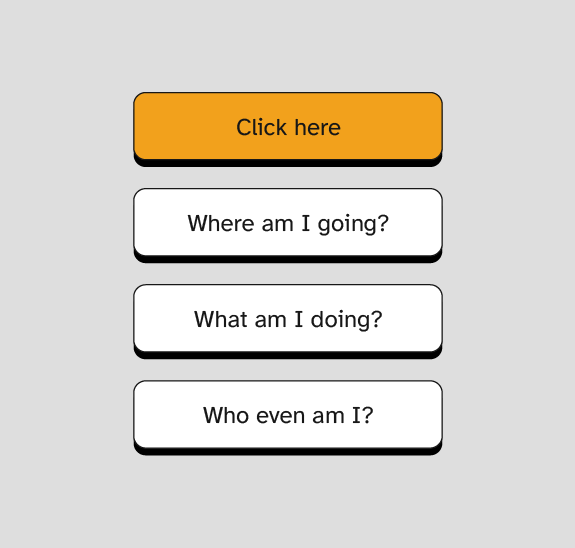
Link copy should always be clear and descriptive. Avoid generic phrases like ‘click here’ or ‘learn more’ as they provide no context to users relying on assistive technologies. Why would you click on a link if you had no idea where it would take you? Instead, use specific and meaningful descriptions that accurately reflect where the link will take you. By doing this you’ll improve the navigation experience for all users.

Use more than colour to mark hyperlinks
Many business owners often overlook this aspect of accessibility. When adding hyperlinks within your copy, ensure you use more than colour alone to distinguish them. Underlining links is the recognised formatting standard for text links. You could also vary the font style, or use icons to provide extra visual cues. By using these visual indicators, it’s easier for all users to identify and interact with links.
Check colour contrast
Colourblind or low-vision users may have difficulty distinguishing between certain colours. To ensure your website is accessible to them, check the colour contrast of your text and interactive content. Use online colour contrast tools (we like colourcontrast.cc) to make sure your text is easy to read against the background colour. By making your content more legible, you’ll enhance the user experience for everyone.
Provide concise and helpful alt text
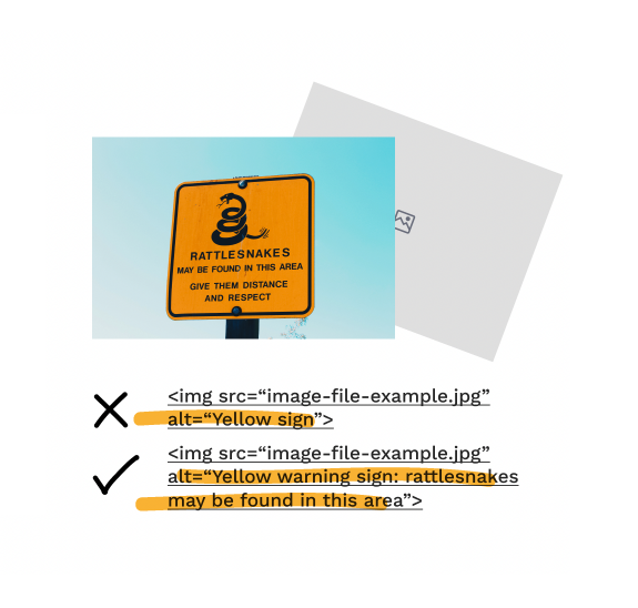
Images play a vital role in engaging your audience, but they can present barriers for people with visual impairments. Make sure you include alt text (image alternative text) for all non-decorative images to provide concise and helpful descriptions. Alt text is vital for users who rely on screen readers, but it also improves the accessibility and inclusivity of your website. You can use this alt text decision tree to understand what alternative text would be most useful to readers.

The power of accessibility: Improved SEO
Beyond the importance of inclusivity, improving website accessibility can also improve your SEO. Search engines prioritise websites that are accessible, as they often provide a better user experience. By implementing these measures, you can expand your reach to a wider audience and also improve your search engine rankings. Potentially driving more organic traffic to your website.
Conclusion
As a business owner, taking steps to improve the accessibility of your website is an investment in both inclusivity and success.
By making simple changes to your content and design, such as:
- structuring your content well;
- testing readability;
- using clear link copy;
- marking links beyond colour;
- checking colour contrast; and
- providing alternative text for images.
You’ll make your website more accessible to all users. Improving accessibility is not just the right thing to do – it’s a strategic move that can enhance your business’s reach and reputation. So why wait? Take action today and make your website more inclusive.
Want to learn more about improving website accessibility?
Get in touch! Marvellous Humans offers a homepage audit service and website fix-up to improve accessibility of your website. Let’s work together to create a more inclusive and connected online world.
